こんにちはフロントエンドエンジニアのまさにょんです!
今回は、CSS の class名で wrapper と container の違いとは? 使い分け方について解説していきます。
目次
wrapper と container の違いと、使い分け方について
class名で wrapper と container の違いとは?
まずは、結論から言うと、wrapper と containerの使い分け方に明確な答えはありません。
こちらの説明がわかりやすいので、引用します。
明確に決まりがあるわけではなくコーディングをしたその人の流儀によるのでなんともいえないんですが、
一般的には、wrapperはデザインのアウトライン用、
containerはコンテンツ内の共有幅指定用に利用されていることが多いとおもいます。
containerでまとめたものよりさらに外側にあるかたまりをまとめて、
それに名前をつけなければならない場合 wrapperでみたいな感覚です。
最近はヘッダ、フッタが100%になるデザインが多いのですが、
昔はヘッダフッタをふくめた全体をまとめて中央寄せにしておくための divが必要なことがおおくて、
それに wrapperという名前をよく使ってました。
いまはレスポンシブが当たり前になって、containerだけあればなんとかなるデザインも多いですよね。
引用元: CSSのclassでwrapperとcontainerの違いはなんですか?
上記の説明にあるとおり、wrapper とcontainerの使い分け方に明確な答えはなく、
その人のコーディングスタイルや、Teamのルールによって変わります。
ただ、私の場合は、上記の人が説明するように、
Wrapperが大きな括りで、その中に 1つのBlock単位で、Containerがあるような構造・使い分けにすることが多いです。
wrapper と container の使い分け SampleCode
Wrapperが大きな括りで、その中に 1つのBlock単位で、Containerがあるような構造・使い分けにするとは、
どういうことか、SampleCodeを見ていきます。
<html lang="ja">
<head>
<meta charset="UTF-8" />
<meta name="viewport" content="width=device-width, initial-scale=1.0" />
<title>CSS_Class名🔥</title>
<style>
html,
body {
height: 100%;
margin: 0;
padding: 0;
font-family: "Times New Roman", Times, serif;
font-size: 18px;
}
.header_area {
position: sticky;
top: 0;
z-index: 999;
height: 120px;
width: 100%;
background-color: #5050e1;
opacity: 0.7;
}
.title_wrapper {
color: #fff;
display: flex;
flex-direction: column;
align-items: center;
justify-content: center;
}
.title {
font-size: 45px;
}
.sub_title {
font-family: "Times New Roman", Times, serif;
font-weight: lighter;
font-size: 22px;
}
.main_contents_wrapper {
width: 85%;
margin: 0 auto;
}
/* グラビア生写真_Area の Wrapper */
.photo_area_wrapper {
display: flex;
flex-wrap: wrap;
flex-direction: row;
justify-content: flex-start;
gap: 20px;
}
.photo_container {
object-fit: cover;
}
.section_title {
font-size: 32px;
}
.text_overray {
position: relative;
top: 80px;
left: 120px;
/* Textが、上部に重ねて見える z-index */
z-index: 2;
}
.footer_area {
width: 100%;
height: 70px;
margin-top: 20px;
display: flex;
justify-content: center;
align-items: center;
background-color: rgba(0, 0, 0, 0.1);
}
</style>
</head>
<body>
<header class="header_area">
<!-- Wrapper -->
<h1 class="title_wrapper">
<span class="title">Robotama開発計画</span>
<span class="sub_title">Robotama is Beautiful🔥</span>
</h1>
</header>
<main>
<!-- Main Contents の Wrapper -->
<div class="main_contents_wrapper">
<!-- What's Robotama? Section -->
<section>
<h2 class="section_title text_overray">What's Robotama?</h2>
<div>
<img
src="https://masanyon.com/wp-content/uploads/2022/11/d86f450b53c3f637a992b2a5433348c7-1024x768.jpg"
alt="Robotama_1"
width="500"
height="350"
/>
</div>
</section>
<section>
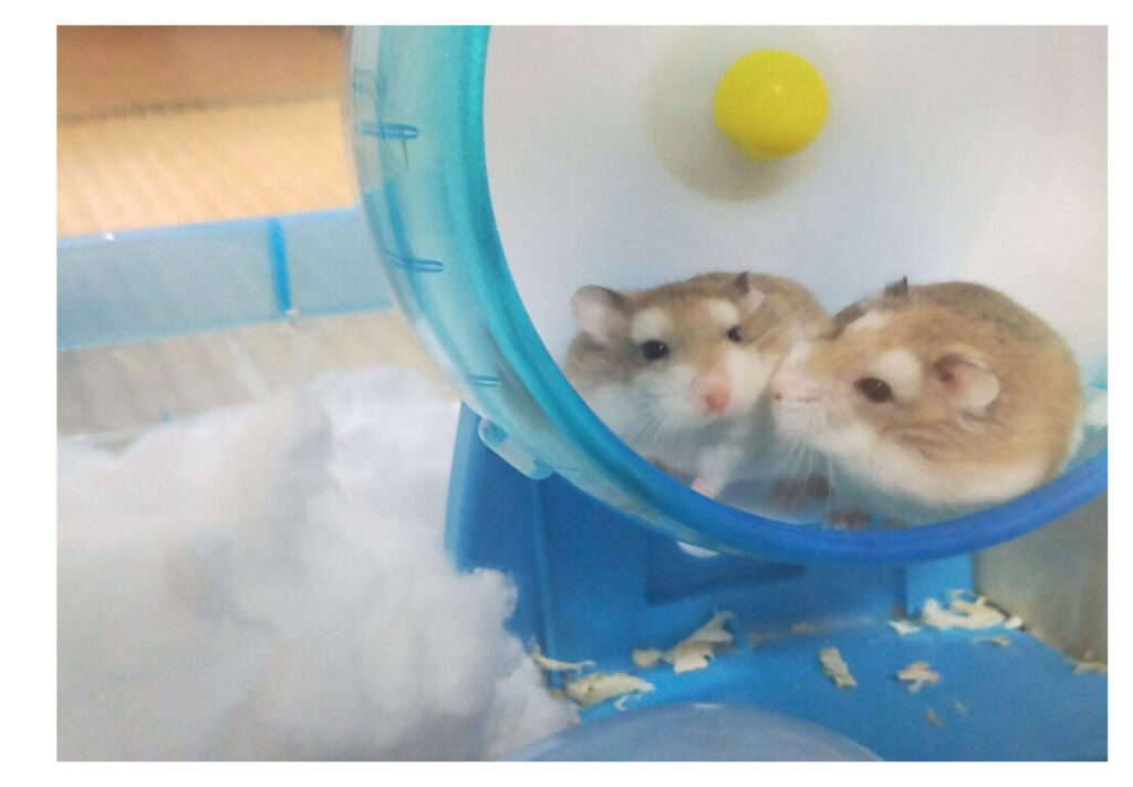
<h2 class="section_title">Robotama gravure photo collection</h2>
<!-- Photo Area Wrapper -->
<div class="photo_area_wrapper">
<!-- Photo Container -->
<div class="photo_container">
<img
src="https://masanyon.com/wp-content/uploads/2022/11/robotama-kawaii-1024x768.jpg"
alt="Robotama_2"
width="500"
height="350"
/>
</div>
<div class="photo_container">
<img
src="https://masanyon.com/wp-content/uploads/2022/11/robotama-2-1024x768.jpg"
alt="Robotama_3"
width="500"
height="350"
/>
</div>
<div class="photo_container">
<img
src="https://masanyon.com/wp-content/uploads/2022/11/purupuru-robotama-1024x768.jpg"
alt="Robotama_4"
width="500"
height="350"
/>
</div>
</div>
</section>
<!-- アピール・Section -->
<section>
<h2 class="section_title">Robotama's appeal point🔥</h2>
<ol>
<li>コスパがいい!(養うのにコストがかからない!)</li>
<li>お世話が楽ちんで、手間がかからない!</li>
<li>とにかく可愛い!</li>
</ol>
</section>
<!-- お値段・Section -->
<section>
<h2 class="section_title">How much Robotama?</h2>
<div>本体価格は、数千円(1~3千円)位で、コスパが超いいです!</div>
</section>
</div>
</main>
<footer class="footer_area">
<div>
<small>© 2023 ロボ玉先端技術研究所 All rights reserved.</small>
</div>
</footer>
</body>
</html>この中で、例えば、class="photo_area_wrapper"の箇所は、複数の要素を包み込む Wrapperです。
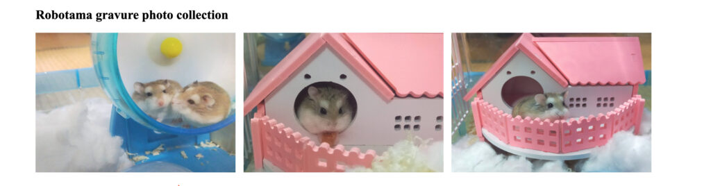
そして、この中にある1つ1つの要素には、class="photo_container"を付与して、Styleを整えています。
このように、
- Wrapperは複数の要素を包み込む大きな枠組みのStyle。
- Containerは、1つの要素を包み込むStyle。
と使い分けるのが、個人的には、わかりやすくて、おすすめです。
プログラミング学習・エンジニア転職関連の情報
自宅で現役エンジニアから学べる『TechAcademy』 (エンジニア転職保証)
『GEEK JOBキャンプ』スピード転職コース(無料)
【IT道場】入校時0円! 就職目的プログラミングスクール
エンジニア転職なら100%「自社開発」求人に強い【クラウドリンク】
『techgym』 (Python特化・無料)
Twitterやってます!Follow Me!
神聖グンマー帝国の逆襲🔥
神聖グンマー帝国の科学は、世界一ぃぃぃぃぃぃ!!!!!
参考・引用
最近の投稿
 【SQL】1回のINSERTで、複数行のレコードを一括挿入・一括追加する方法
 JavaScriptでランダムなuuidを作成する方法(randomUUIDの使い方)
 PythonでCSVをJSONに変換する方法
 PythonでCSV・Dataframeを指定の行数まで切り取る方法
 JavaScript(TypeScirpt)のfor-of文でindexの値も取得する方法と、Type IterableIteratorエラーの解決方法
 VSCode上のPython import文の「インポート “XXXXX” をソースから解決できませんでした」エラーの解決方法